# Beginner's Guide to Understanding Candlestick Charts
This comprehensive guide equips novice traders with essential knowledge to master candlestick chart reading—a fundamental technical analysis tool for informed investment decisions. Learn how candlesticks represent price movements through open, high, low, and close data points, enabling you to interpret market dynamics and trader sentiment. Discover how to read color-coded candles, identify trends, and recognize patterns across multiple timeframes on Gate. While exploring candlestick limitations and introducing Heikin-Ashi alternatives, this guide provides the foundational skills necessary for sustainable trading success. Perfect for beginners seeking to transition from intuition-based trading to probability-driven strategies, this resource combines visual chart interpretation with practical insights for analyzing financial markets effectively.
A Beginner's Guide to Candlestick Charts
Introduction
For beginners entering the world of trading and investing, reading charts can seem like a daunting task. While some traders rely on intuition and gut feelings to make investment decisions, this approach may work temporarily in favorable market conditions but is unlikely to succeed in the long term. Trading and investing are fundamentally games of probability and risk management. Therefore, the ability to read candlestick charts—a fundamental technical analysis tool—is essential for almost every investment style and strategy.
What is a Candlestick Chart?
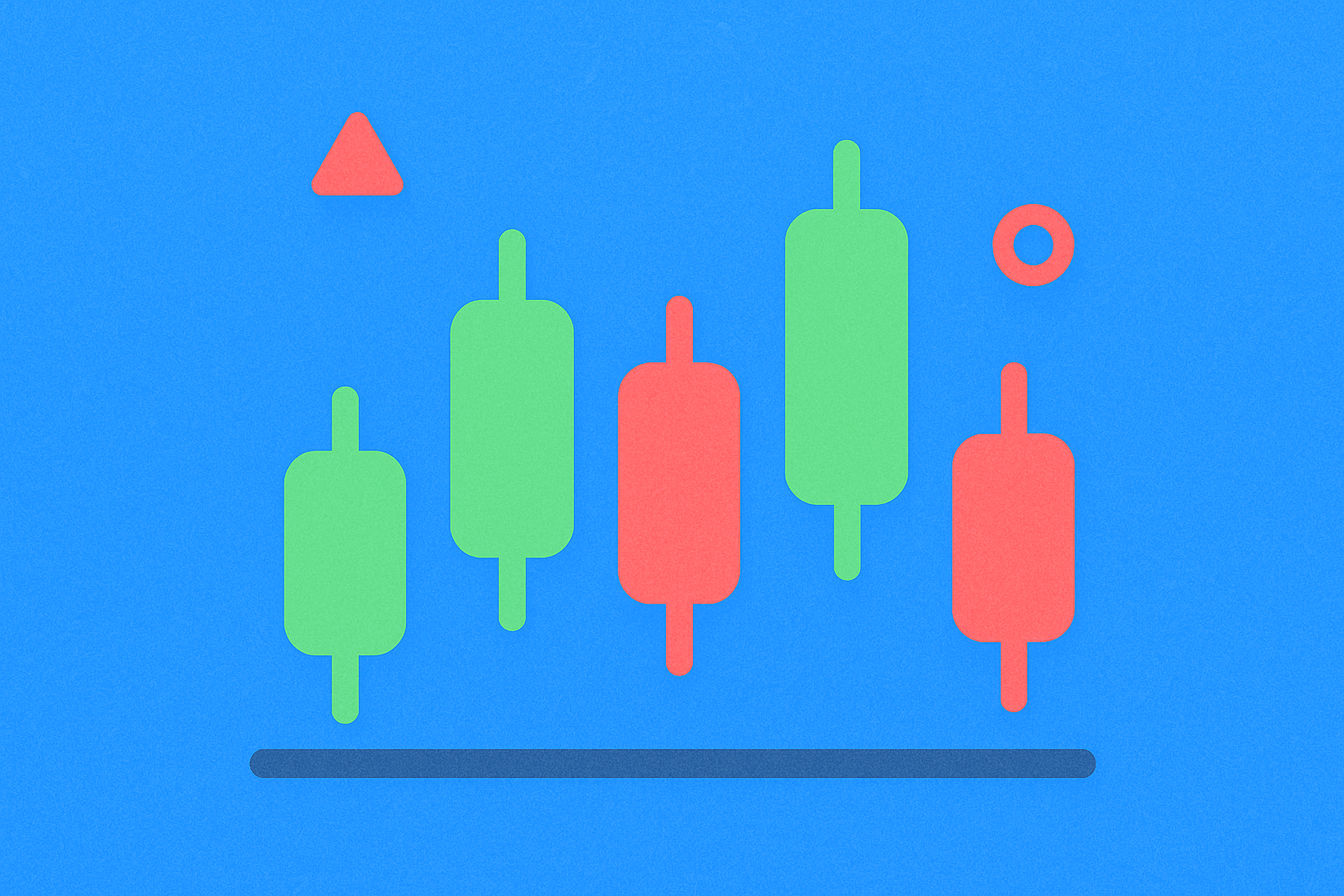
A candlestick chart, often referred to as "candles" in trading terminology, is a type of financial diagram that graphically represents the price movements of an asset over a specific time period. As the name suggests, it consists of candlesticks, each representing the same time span. These candlesticks can represent virtually any time period, from seconds to years. Candlestick charts have been in use since approximately the 17th century, with their development as a charting analysis tool often credited to a Japanese rice trader named Homma. While candlestick charts can be used to analyze various data types, they are primarily employed to facilitate the analysis of financial markets and trading activities across leading trading platforms.
How Candlestick Charts Work
Each candlestick is constructed using four essential price points:
Open represents the first recorded trading price of the asset within the specific time frame. This serves as the starting point for the analysis period.
High indicates the highest recorded trading price of the asset during the time frame, showing the maximum price reached by traders.
Low shows the lowest recorded trading price of the asset within the same time frame, representing the minimum price level achieved.
Close represents the final recorded trading price of the asset at the end of the specific time frame.
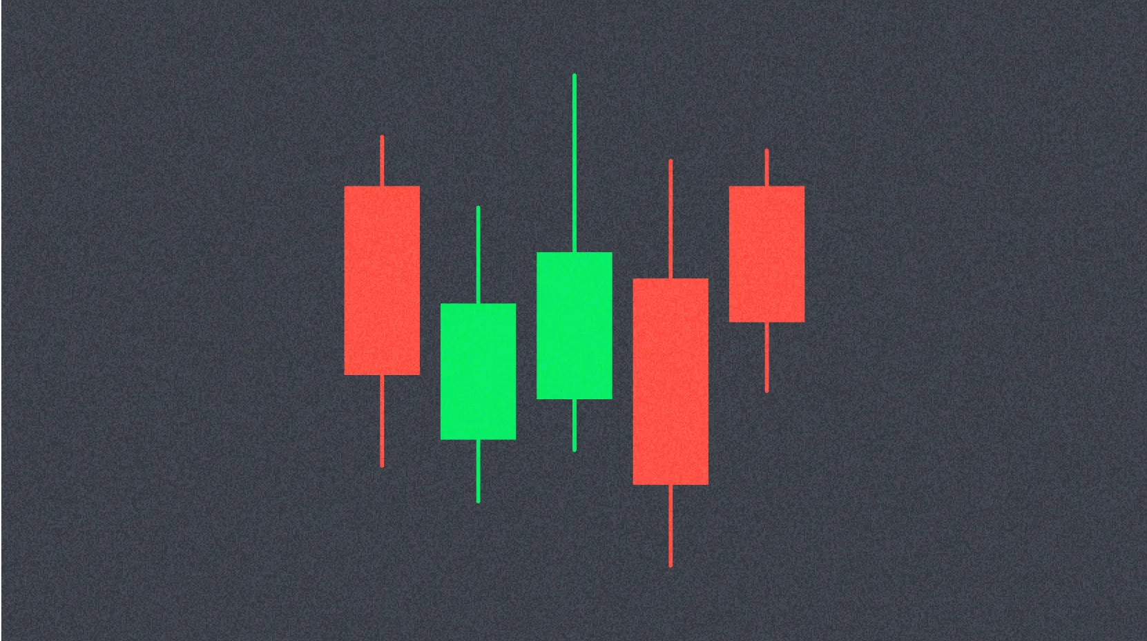
The distance between the opening and closing prices is called the "body" of the candlestick, while the distance between the body and the high/low prices is called the "wick" or "tail." This structure creates the distinctive candle-like appearance that gives the chart its name. Understanding these components is crucial for interpreting market dynamics and trader sentiment during each time period.
How to Read Candlestick Charts
Many traders find candlestick charts easier to read than traditional bar or line charts. Each candlestick tells a story of the struggle between bulls and bears over a specific period. Generally, the longer the body, the more intense the buying or selling pressure during the measured timeframe. Conversely, short wicks indicate that the high or low of the measured period was close to the closing price.
Color plays an important role in interpretation: a green body signifies that the asset's closing price was higher than the opening price, indicating upward price movement and buyer dominance. Red body colors indicate that the price moved downward during the measured timeframe, showing seller dominance. By analyzing patterns of green and red candles, traders can identify trends, reversals, and potential trading opportunities.
What Candlestick Charts Cannot Tell You
While candlestick charts are powerful analytical tools, they have important limitations. Candlesticks do not provide detailed information about what occurred between the opening and closing prices. The wicks show the high and low of a period, but they cannot reveal which occurred first or the sequence of price movements throughout the interval. Additionally, candlestick charts can contain significant market noise, particularly when displayed over shorter time periods. This noise can generate false signals that lead traders to incorrect conclusions. Therefore, candlestick analysis should be combined with other technical indicators and fundamental analysis for more comprehensive market evaluation.
Heikin-Ashi Candlesticks
Heikin-Ashi, which means "average bar" in Japanese, represents a modified candlestick format that uses averaged price data. The primary objective of Heikin-Ashi candlesticks is to smooth price action and filter out market noise, creating a clearer picture of market trends. Traders frequently use Heikin-Ashi candlesticks in combination with traditional Japanese candlesticks to avoid false signals and improve trading accuracy. Green Heikin-Ashi candles without lower wicks generally indicate a strong uptrend, suggesting sustained buying pressure. Conversely, red Heikin-Ashi candles without upper wicks indicate a strong downtrend, suggesting dominant selling pressure. This variation provides traders with an alternative perspective for confirming trends and making more reliable trading decisions.
Conclusion
Candlestick charts represent one of the most fundamental tools for any trader or investor. They provide not only a visual representation of price history for a specific asset but also the flexibility to analyze data across various time frames. By mastering the ability to read candlestick charts, traders can better understand market dynamics, identify trading opportunities, and make more informed investment decisions. While candlestick charts have limitations and should be used in conjunction with other analysis tools, they remain an indispensable component of technical analysis in financial markets. Whether you are a beginner or an experienced trader, developing proficiency in candlestick chart interpretation is essential for long-term trading success.
* The information is not intended to be and does not constitute financial advice or any other recommendation of any sort offered or endorsed by Gate.